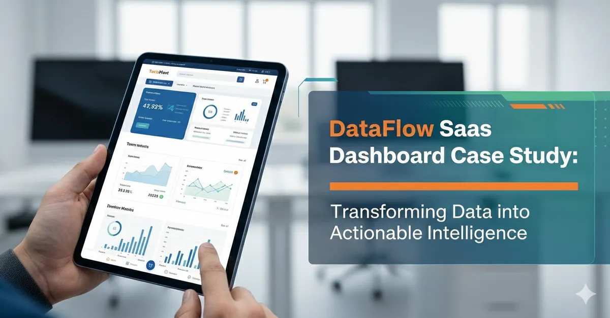
SaaS Dashboard
Overview
DataFlow’s product was powerful, but the dashboard experience didn’t reflect it. Users struggled to find key metrics, configuration screens felt overwhelming, and the UI had grown inconsistent as features shipped over time. The team wanted a cleaner, faster interface that reduced support tickets and improved activation—without slowing down development.
CodeFlow Labs partnered with DataFlow to redesign the dashboard around clarity, scale, and usability.
The Challenge
DataFlow’s main issues were:
- Complex navigation: Users couldn’t quickly jump between pipelines, alerts, and reports.
- Inconsistent UI patterns: Buttons, tables, filters, and modals behaved differently across modules.
- High cognitive load: Dense screens made onboarding and troubleshooting harder than necessary.
- Limited scalability: New features required custom UI each time, creating design debt.
What We Did
1) Mapped user journeys and prioritized “daily workflows”
We focused on the actions users repeat most:
- Monitoring pipeline health
- Investigating failures and alerts
- Adjusting configurations
- Sharing reports with stakeholders
This helped us redesign around speed-to-answer instead of “feature completeness.”
2) Rebuilt information architecture and navigation
- Introduced a clearer module structure (Monitor, Pipelines, Alerts, Reports, Settings)
- Added contextual breadcrumbs and persistent filters
- Improved search and entity switching for multi-project accounts
3) Designed a lightweight dashboard UI system
- Standardized table layouts, filter patterns, and empty states
- Created a consistent component set (badges, statuses, actions, modals)
- Defined visual hierarchy rules for dense data screens
4) Made status and errors easier to understand
- Redesigned alert severity and pipeline health indicators
- Added clearer log presentation with actionable next steps
- Reduced ambiguity with consistent terminology and inline guidance
5) Improved accessibility and interaction polish
- Keyboard-friendly navigation and focus states
- Contrast and spacing adjustments for readability
- Clear loading states to prevent “is it broken?” moments
Results (After Release)
After rolling out the new dashboard experience, DataFlow saw:
- Faster time-to-insight for monitoring and troubleshooting
- Reduced UI inconsistency, making the product feel more mature
- Better onboarding flow, with fewer “where do I start?” support requests
- Improved development velocity thanks to reusable components and patterns
Tech + Design Snapshot
- Outputs: High-fidelity UI, interactive prototypes, component library, UX specs
- Implementation Support: Frontend-ready components and states (loading, empty, error)
- Focus Areas: Data tables, filtering, navigation, alerts, readability, accessibility
Takeaway
DataFlow didn’t need more features—they needed a dashboard that made their existing power easier to access. By aligning the UI with real user workflows and building a scalable design system, CodeFlow Labs helped DataFlow deliver a clearer product experience and a stronger foundation for growth.